
Auto-Tabs Module
Getting Started
Introduction
This guide provides step-by-step instructions for the UNBOUND Auto-Tabs Slider module, designed to enhance the navigation and organization of content on your digital platforms. Auto-tabbing functionality is an efficient way to cycle through content automatically, ensuring dynamic engagement with your site's material.
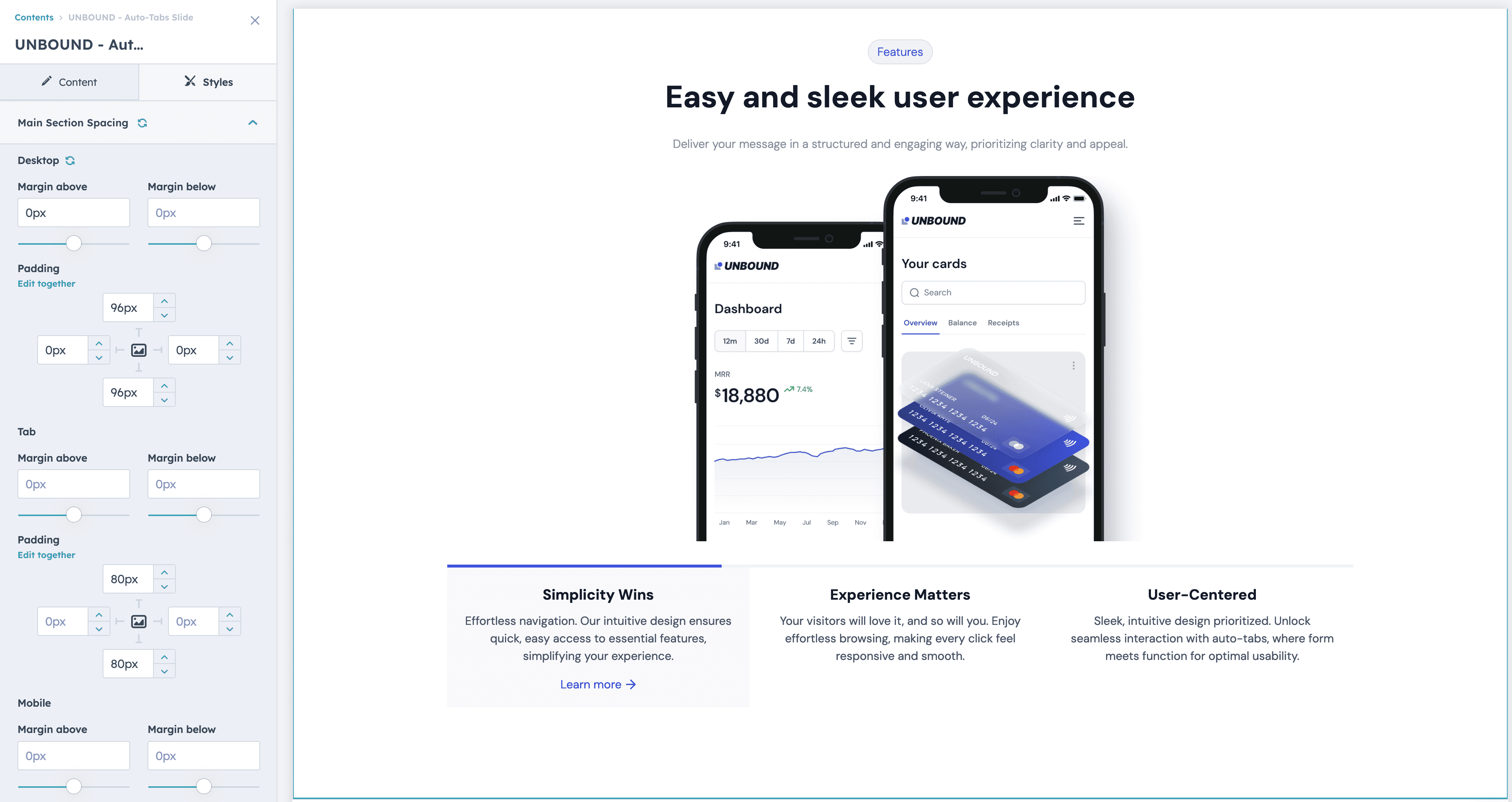
Full Demo
Accessing the Module
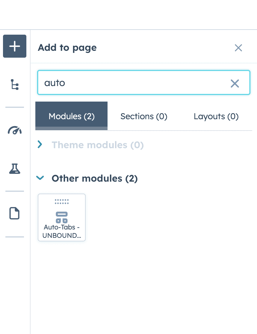
- Click on the plus icon within your editor to access the addition menu.
- Select the 'Modules' tab to view the available modules.
- In the search bar, type 'Auto-Tabs UNBOUND' to find the module.
- Drag the 'Auto-Tabs UNBOUND' module and drop it into your desired location between the sections of your page.
Module Overview
The Auto-Tabs UNBOUND module contains several key areas:
Top Content: The main area where your tabbed content will be displayed and managed.
Tab Card: Each tab card represents a section of content that can be displayed within your tab interface. You can customize the title, add descriptions, and include images or other media types to enhance user engagement. Tab cards are the interactive elements that users will click on or cycle through when auto-tabbing is enabled.
Styles: Customize the look and feel of all elements to match your brand's aesthetics.
For optimal user experience, a maximum of 3 tabs is supported in this module.
Enabling/Disabling Auto-Tabbing
Auto-Tabbing is a feature that allows content to automatically cycle through tabs, making the user experience more dynamic.
- To activate or deactivate auto-tabbing, look for the 'Auto Tabbing On' toggle switch.
- Click the toggle switch to the 'On' position to enable auto-tabbing.
- If you wish to disable auto-tabbing, click the toggle switch back to the 'Off' position.
You can still change tabs manually, even if the auto-tabbing is on.
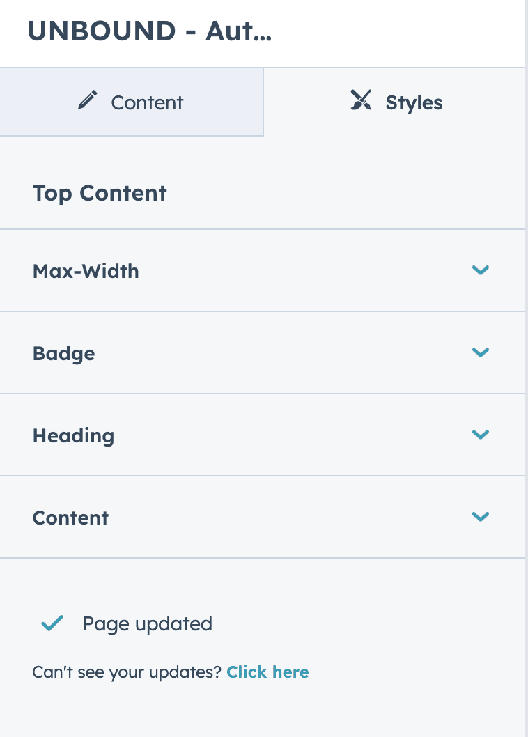
Editing Top Content
Overview
The 'Top Content' section is integral to the Auto-Tabs UNBOUND module. It serves as the primary interface for defining the headline of this page section. This option allows you to add a badge, set headings, and define tags that will be displayed on the topmost part of your module.
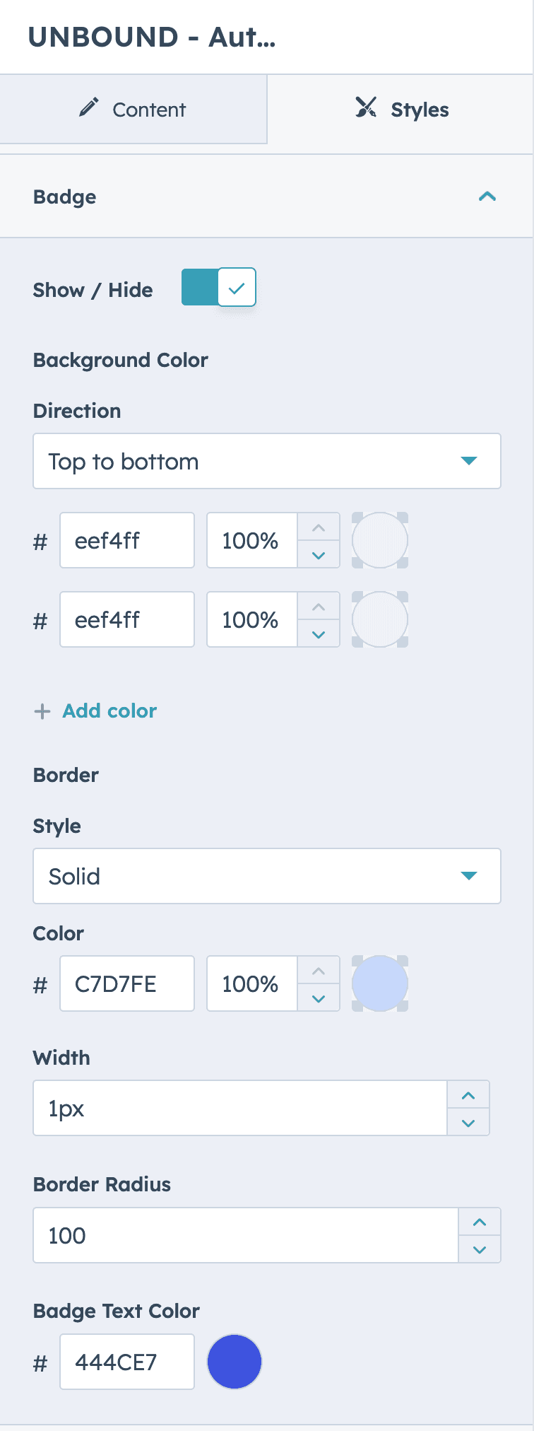
Badge
A badge typically serves as a visual cue to highlight important information or categorize content.
- Locate the 'Badge' field within the 'Top Content' section of the module.
- Click inside the 'Badge' text box.
- Enter the text you want to appear as the badge label. Keep it concise to ensure it's easily readable.
Tips for Badge Usage
- Use keywords or short phrases for effective communication.
- Badges are typically used to highlight the status or category of the content, such as 'New', 'Sale', or 'Popular'.
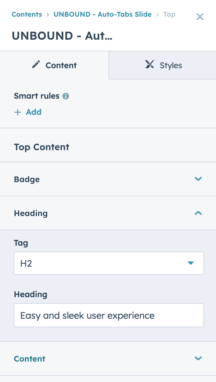
Heading
Headings are crucial for providing a title or a brief introduction to the tab content.
- Set Heading: Click on the 'Heading' field.
- Input Text: Enter the text you wish to use as the heading for your top content.
- Select Tag: Use the 'Tag' dropdown to define the HTML tag for your heading, such as H1, H2, etc. This will determine the size and hierarchy of your heading in the web structure.
Tag
The 'Tag' option allows you to set the semantic HTML tag for your heading, affecting SEO and accessibility.
- Access Tag: Click on the 'Tag' dropdown menu.
- Choose Tag: Select the appropriate HTML tag that reflects the importance and hierarchy of your heading (e.g., H1, H2, H3, etc.).
It's recommended using only one H1 per page for SEO purposes.
Content
The main text area where you can provide more detailed content related to the tab.
- Input Content: Click in the 'Content' field.
- Add Text: Type or paste the desired content that will accompany your heading.

Configuring Tab Cards
Accessing Tab Cards
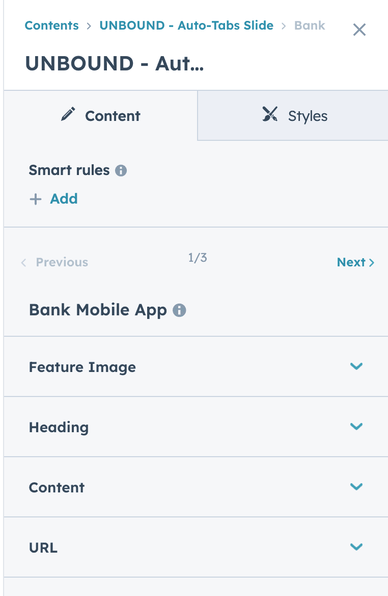
Navigate to the 'Tab Card' you wish to configure by using the 'Previous' and 'Next' navigation or by selecting the specific card from the list.
Feature Image
- Add Image: Click the 'Feature Image' dropdown to expand the options.
- Upload: Choose an image file that represents the content of this tab card. This image will be displayed prominently in your tab.
Heading
- Choose Tag: Select the appropriate HTML tag that reflects the importance and hierarchy of your heading (e.g., H1, H2, H3, etc.).
- Edit Heading: Enter a title in the 'Heading' field. This will serve as the main title or topic of your tab card. Keep it short and sweet, otherwise your layout will start to break.
Content
Input Content: Provide some information related to the tab card in the 'Content' text box. This will should describe the feature or image you are showcasing within that tab. Again, keep it short, so your layout is preserved.
URL
Link to More Information: Insert a relevant URL in the 'URL' field to direct users to additional content or a related webpage when they interact with this tab card.
Pro tip: If you keep all text snippets the same length for the content of your tabs, they will align perfectly.
Customizing Images for Responsive Design
To ensure your content is optimally displayed across various devices, the Auto-Tabs UNBOUND module provides the flexibility to set different images for tablet and mobile views.
Image for Tablet View
- Locate the toggle labeled "Image for Tablet View"
- Switch the toggle on to activate this feature.
- Once activated, you'll be prompted to upload or select an image that is specifically tailored for the tablet view.
- Choose an image that is appropriately sized and composed to look its best within the tablet's screen dimensions.
Image for Mobile View
- Find the toggle named "Image for Mobile View."
- Turn this toggle on to enable the option to select a unique image for mobile devices.
- Upon enabling, you'll have the option to upload or choose a distinct image that will be used when the module is viewed on mobile devices.
- Select an image that is optimized for smaller screens to ensure clarity and proper layout on mobile devices.
By customizing images for different screen sizes, you can maintain a consistent aesthetic and improve the user's experience on your site.
Style Customization Guide
The Styles section is your toolkit for visual customization, enabling you to create a visually coherent and impactful user interface. Here, you can fine-tune the appearance of your content to align with your brand identity.
Main Section Spacing
- Access Padding Settings: Locate the 'Padding' option within the 'Main Section Spacing' category.
- Uniform Adjustment: To apply the same padding value to all sides of the main section, ensure 'Edit together' is selected.
- Specify Value: Enter the padding value in the provided field. This value sets the internal space on all sides of the main section, creating uniform spacing around your content.
By setting a consistent padding value, the design will maintain visual balance and ensure content is neatly presented and accessible across desktop, tablet, and mobile views.
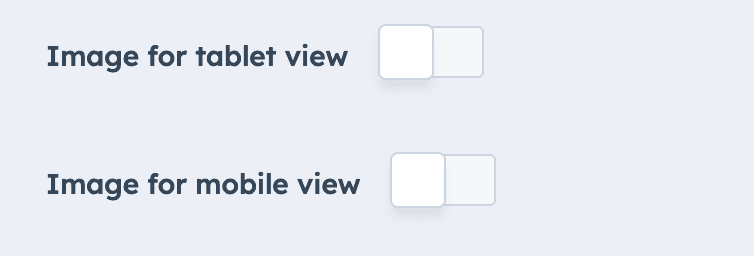
Image Padding Configuration
All Views (Desktop, Tablet, Mobile).
- Select 'Edit together': To apply consistent padding around the image, ensure the 'Edit together' option is activated. This will synchronize the padding value for all sides of the image.
- Enter Padding Value: Input the desired padding amount in pixels. This value controls the space between the image and its surrounding elements, providing visual separation and emphasis.
Adjust the padding as needed to ensure the image is well-integrated into the tab layout and visually appealing across all device views. Remember to check the results on different devices to maintain a responsive design.
The Dark Mode Styles
We provided the styles of our dark mode seen in our demo
Section:
- Click "Section" in Contents panel and define your background for the entire section
- Select "Background" dropdown
- Enter this HEX #0c111d
Badge: This is up to your branding preferences, width and styles. Here's what we used for our colors:
- Go to the Styles tab > Top content > Badge.
- Set both Background Colors to #1f235b (100%).
- Set the Text Color to #2d31a6 (100%).
Header:
- Go to the Styles tab > Top content > Heading.
- The headline is white, so #ffffff.
Supporting text:
- Go to the Styles tab > Top content > Content.
- Set this text color to #87909e.
Tab content styles:
- Go to the Styles tab > Tab content.
- Set Heading color to #ffffff.
- Set the content color to #6c7885.
- Set the link color to #8098F9.
Inactive Tabs:
- Go to Styles tab > Tab Background Colors.
- You can make this tab the same HEX value as the section background (#0c111d) or turn opacity to 0%.
- Se the border to HEX #1F242F.
Active Tab:
- Set top color to #161b26 (100%)
- Set bottom color to #161b26 (0%)
- Set border color to #6172f3 (100%)
- Set the supporting text to #87909e.

Top Content Style Configuration
General Styling Options
- Max-Width: Set the maximum width for the top content to ensure proper scaling across different screen sizes.
- Badge: Customize the appearance of the badge element, including visibility, background color, border, and text color.
- Heading: Style the heading text to match your branding with options for font, size, and color.
- Content: Adjust the body text styling to maintain readability and visual comfort for users.
Detailed Badge Styling
- Show/Hide: Toggle the visibility of the badge using the 'Show/Hide' switch.
- Background Color:
- Click on the color field to pick a new background color.
- Use the 'Add color' option for gradient backgrounds and set the direction (e.g., top to bottom).
- Border:
- Choose a 'Style' for the border, such as solid, dotted, or dashed.
- Pick a 'Color' for the border, aligning it with your design palette.
- Set the 'Width' of the border, which defines the thickness of the badge's outline.
- Border Radius: Input a value to round the corners of the badge. A higher value will create a more circular shape.
- Badge Text Color: Select a color for the text inside the badge to ensure legibility against the badge background.
Make sure to preview these style changes to see how they display on your page and adjust as needed to achieve the best visual outcome.
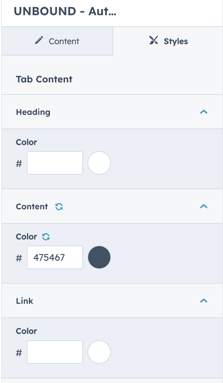
Tab Content Style Configuration
Heading
- Color: Click on the color selection box next to 'Color' under the 'Heading' section.
- Pick Color: Choose a color that best suits your heading. This color will apply to the text of the heading within the tab content.
Content
- Color: For the main body of text within the tab content, click on the color box next to 'Color' under the 'Content' section.
- Select Color: Choose a color that provides good readability and matches your design theme.
Link
- Color: To set the color for hyperlinks within the tab content, click the color box next to 'Color' under the 'Link' section.
- Choose Color: Select a color that stands out from the regular text color to make links clearly identifiable.
Make sure the chosen colors for the heading, content, and links are distinct enough to differentiate each element but cohesive with the overall design. Always preview changes to ensure the colors work well together and maintain accessibility standards.
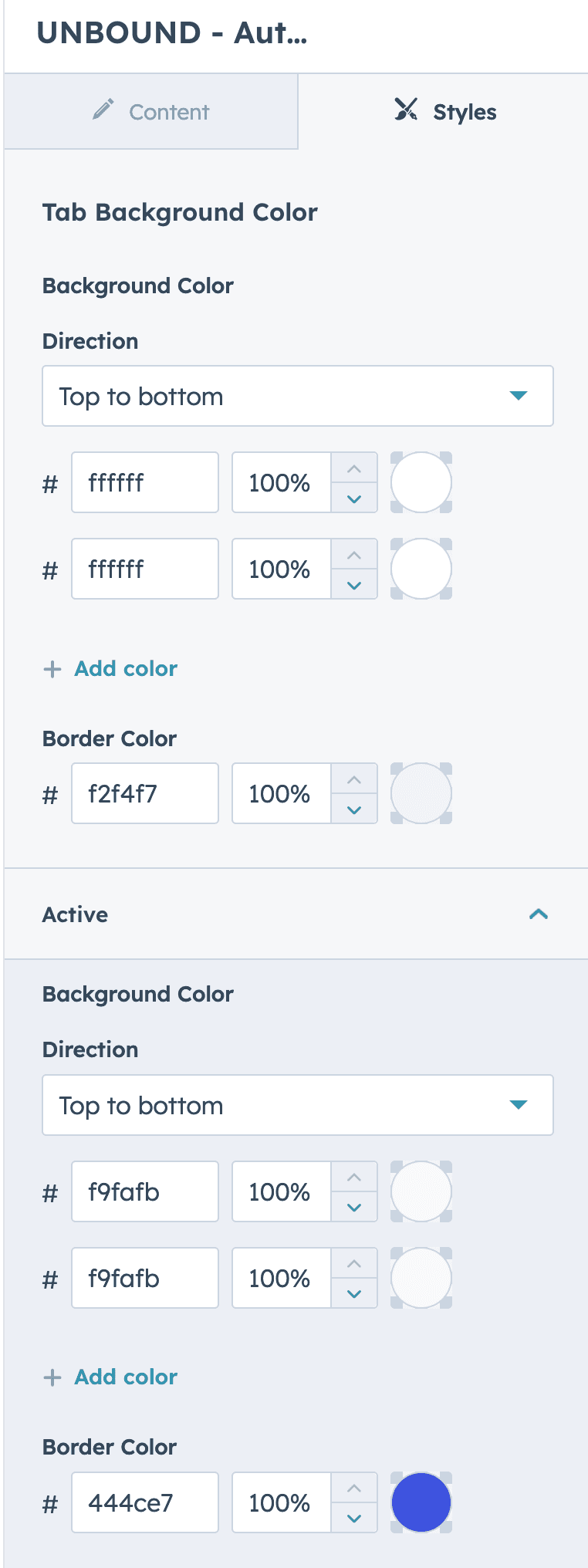
Tab Background Color Styling
Background Color for Inactive Tabs
- Select Background Color: Click on the color field to set the background color for inactive tabs.
- Choose Direction: If you wish to create a gradient, select the 'Direction' of the gradient flow (e.g., top to bottom).
- Add Color for Gradient: To add a gradient, click 'Add color' and select additional colors as needed.
- Set Border Color: Click on the border color option to define the border for the tab.
Background Color for Active Tabs
- Select Background Color: Click on the color field to set the background color for the active tab.
- Choose Direction for Gradient: If using a gradient, select the direction you wish the gradient to flow.
- Add Color for Gradient: Click 'Add color' to include additional gradient colors.
- Set Border Color: Define a border color to distinguish the active tab from the inactive ones.
Ensure that the background colors for both inactive and active tabs have enough contrast to differentiate between the two states. This not only adds to the visual appeal but also enhances user navigation through the tabs. Preview the changes to confirm the tabs are visually distinct and attractive across different devices.
Auto Tabbing Configuration
Autoplay Speed
- Locate the 'Autoplay speed' setting within the 'Auto tabbing' section.
- Set the desired time interval for how often the tabs will automatically change. You can input a different number to speed up or slow down the autoplay.
Adjusting the autoplay speed allows you to control the duration each tab content is displayed before automatically transitioning to the next one, enhancing the user experience by allowing enough time for reading and engagement.

Tips and Best Practices
Consistency
Maintain a consistent look and feel across all tabs and content to create a cohesive user experience. Consistent use of colors, fonts, and spacing will help reinforce your brand identity.
Contrast
Ensure there is sufficient contrast between text and background colors, especially for headings and links. This not only aids readability but also accessibility.
Responsiveness
Regularly preview changes across different devices to ensure your content is responsive and visually appealing on all screen sizes.
Simplicity
Aim for a clean and uncluttered design. Overly complex designs can distract from the content and may not translate well across different devices.
Readability
Choose font sizes that are easy to read on small and large screens. When in doubt, err on the side of larger text sizes for better readability.
Speed
Be mindful of the autoplay speed in auto-tabbing. It should be fast enough to keep users engaged but slow enough to allow adequate reading time.
Testing
Test the module thoroughly after customization. Check for any visual or functional issues that might have arisen from the changes.
Accessibility
Consider all users by ensuring your module is accessible. This includes adding alt text to images, ensuring navigational elements are keyboard accessible, and more.
Backup
Before making any significant changes, save a backup of your current settings. This provides a safety net to revert changes if needed.
Documentation
Keep a record of the changes made to styles and configurations. This documentation will be valuable for future updates or for other team members who may work on the module.
Remember, the goal of customization is to enhance the user experience while delivering content effectively. Keep the user journey in mind when making design decisions.