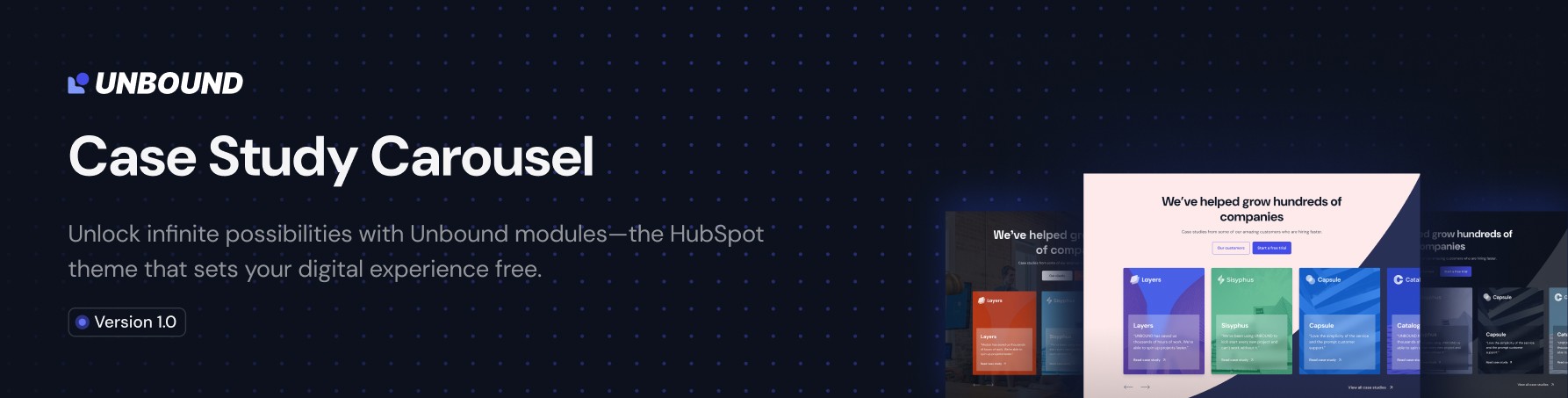
Case Study Carousel PRO
Overview
The UNBOUND Case Study Carousel PRO module is a sophisticated carousel component designed to showcase client case studies, testimonials, or portfolio items in an interactive, visually appealing format. This module provides extensive customization options for both content and styling, making it suitable for professional websites requiring high-quality presentation of success stories.
Content Tab Features
Elements Control
Purpose: Control the visibility of major module components.
- Logo: Toggle to show/hide the top logo section
- Card Content: Toggle to show/hide the card content area
Use Case: Hide elements to create a simplified image slider or focus on specific content areas.
Top Content
Content Type Options:
- Default (Heading & Text): Separate fields for heading and subheading with individual HTML tag selection
- Rich Text Editor: Single rich text field for complete content control
Default Mode Features:
- Heading: Customizable text with HTML tag selection (H1-H6, P)
- Subheading: Additional content text with HTML tag selection
- Semantic HTML: Proper heading hierarchy for SEO optimization
Rich Text Mode Features:
- Full WYSIWYG Editor: Complete formatting control
- Mixed Content: Combine headings, paragraphs, lists, and formatting in one field
Button Configuration
Button Quantity: Up to 2 buttons per module
Button Types:
- HubSpot CTA: Integration with HubSpot's CTA system for tracking and analytics
- Regular Button: Standard link button with custom styling
Regular Button Options:
- Button Style: Primary or Secondary styling
- Button Text: Custom text content
- Button Link: Full link configuration with external/internal options
- Link Behavior: Open in new tab, no-follow attributes
Card Content
Repeatable Card Structure: Add unlimited case study cards
Per Card Configuration:
Feature Image
- Image Upload: High-resolution case study images
- Image Fit: Cover, contain, or custom fitting options
- Background Position: Center, top, bottom, left, right positioning
Logo Section
- Company Logo: Client or company logo upload
- Logo Sizing: Automatic sizing with responsive behavior
Content Areas
- Heading: Card title with HTML tag selection (H1-H6, P)
- Content: Description text with HTML tag selection
- Font Size: Custom font size control for content text
Call-to-Action
- URL Text: Custom link text (e.g., "Read case study")
- URL Link: Full link configuration
- Show/Hide Toggle: Optional link display
Visual Overlays
- Card Background Overlay: Color overlay with opacity control
- Content Box Background: Semi-transparent background for text readability
Hover Effects
- Hover Content: Custom text displayed on card hover
- HTML Tag Selection: Semantic markup for hover content
Style Tab Features
Top Content Styling
Max-Width Control
- Predefined Widths: XXS (320px) to 6XL (1920px)
- Custom Width: Pixel-perfect custom width control
Typography Styling
- Heading Colors: Text color with opacity control
- Content Colors: Separate color control for subheading text
- Rich Text Styling: Independent color and font size control for rich text mode
- Font Size Control: Pixel-based font size adjustment
Content Spacing
- Content Spacing: Pixel-based spacing between content elements
Card Styling
Card Height Management
- Aspect Ratio Control: Enable/disable aspect ratio constraints
- Custom Aspect Ratios: Width and height ratio configuration (default 16:9)
- Maximum Height: Optional height limits with pixel control
- Minimum Height: Ensure consistent card heights across the carousel
Card Spacing & Borders
- Card Padding: Internal spacing within cards (pixel-based)
- Border Radius: Rounded corner control (pixel-based)
- Card Hover Shadow: Shadow color and opacity for hover effects
Content Positioning
- Content Alignment: Left, center, right, start, end positioning
- Content Padding: Spacing token system (spacing-xs to spacing-9xl)
Typography Controls
- Heading Colors: Card title text colors
- Content Colors: Card description text colors
- Link Colors: CTA link text colors
- Arrow Colors: Link arrow icon colors
- Font Sizes: Independent font size control for different text elements
Background Settings
Background Type Options
- Solid Color: Single color background with opacity
- Background Image: Full image background with positioning controls
Decorative Elements
- Background Shape: Toggle decorative shape element
- Shape Color: Custom color control for decorative elements
Image Overlay System
- Show/Hide Overlay: Toggle image overlay
- Overlay Color: Color and opacity control for image overlays
- Readability Enhancement: Improve text contrast over images
Slider Options
Carousel Behavior
- Carousel Speed: Transition speed in milliseconds (default: 1000ms)
- Active Autoplay: Enable/disable automatic slide progression
- Autoplay Delay: Time between automatic slides in milliseconds
Navigation Controls
- Active Arrows: Show/hide navigation arrows
- Custom Arrow Images: Upload custom previous/next arrow graphics
- Arrow Positioning: Custom padding control for arrow placement
Spacing Controls
- Custom Padding Toggle: Enable custom spacing controls
- Card Wrap Padding: Top and bottom padding for card container
- Arrows Padding: Top and bottom padding for navigation arrows
Section Spacing
Global Spacing Control:
- Spacing Options: No spacing to 9X Large (160px)
- Responsive Spacing: Consistent spacing across device sizes
- Spacing Tokens: Predefined spacing system for design consistency
Technical Specifications
Responsive Behavior
- Mobile Optimization: Automatic responsive adjustments
- Touch Navigation: Swipe gestures on mobile devices
- Flexible Layouts: Adapts to various screen sizes
Performance Features
- Lazy Loading: Images load as needed for performance
- Optimized Assets: Compressed images and efficient code
- Smooth Animations: Hardware-accelerated transitions
Accessibility Features
- Semantic HTML: Proper heading hierarchy and markup
- Keyboard Navigation: Full keyboard accessibility
- Screen Reader Support: ARIA labels and descriptions
- Focus Management: Proper focus indicators
Integration Capabilities
- HubSpot CTA Integration: Native CTA tracking and analytics
- Theme Inheritance: Inherits global theme colors and fonts
- Custom CSS Support: Additional styling through theme customization
Best Practices
Content Strategy
- Consistent Image Dimensions: Use similar aspect ratios for visual harmony
- Compelling Headlines: Clear, benefit-focused card titles
- Concise Descriptions: Brief, impactful case study summaries
- Strong CTAs: Action-oriented link text
Visual Design
- Brand Consistency: Use brand colors and fonts throughout
- Readable Contrast: Ensure text is readable over background images
- Logical Hierarchy: Proper heading structure for SEO
- Mobile-First: Test on mobile devices for optimal experience
Performance Optimization
- Image Optimization: Compress images before upload
- Reasonable Autoplay: Use conservative autoplay timing
- Content Length: Keep descriptions concise for better performance
Module Limitations
- Maximum Buttons: 2 buttons per module
- Card Content: No character limits, but performance considerations apply
- Image Formats: Standard web formats (JPG, PNG, SVG, WebP)
- Browser Support: Modern browsers with CSS Grid and Flexbox support
Support Resources
- Support: PHRUTOS Support
- Module Version: PRO Edition with advanced features